A different mental model
The form looked and behaved very differently from the familiar monolithic version.
Redesigning inDrive’s courier order form to improve conversion and adapt to regional requirements.
Explore the case ↓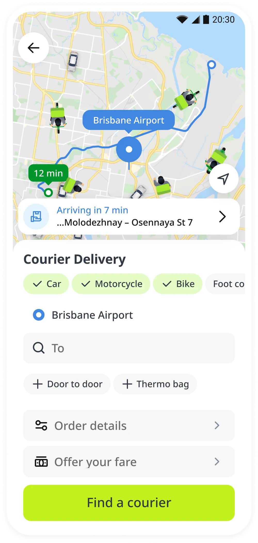
inDrive moved from a monolithic to a microservice architecture, rolling out a new design alongside the codebase update. For courier delivery, the changes went further: new UI components, a revised UX, and new market-standard features created a very different experience.
After launch, V20 (View to Order) conversion fell by an average of 16% across all cities.
Average drop across all cities
The new form had to support a growing service. But the change disrupted the way people were used to placing an order.
The form looked and behaved very differently from the familiar monolithic version.
The long, single-page layout made ordering feel heavy and demanding.
Users expected to check the price after setting point B, to compare services or decide whether the price was acceptable. Repricing was now at the end.
Rolling back was impossible: the old form belonged to the phased-out monolithic architecture and lacked essential new features.
Users could no longer check the price immediately after setting point B. Moving the price block to the second step was one of the main reasons conversion dropped.
We couldn’t simply move it to the first step: both the final and recommended prices depended on information entered in the preceding fields.
I organized a brainstorming session with the courier design team. Each designer explored a concept, then we refined the ideas for UX testing.
The brief: familiar, visually light, quick to complete, and clear about value and price — while still collecting the information needed to match and fulfil an order.
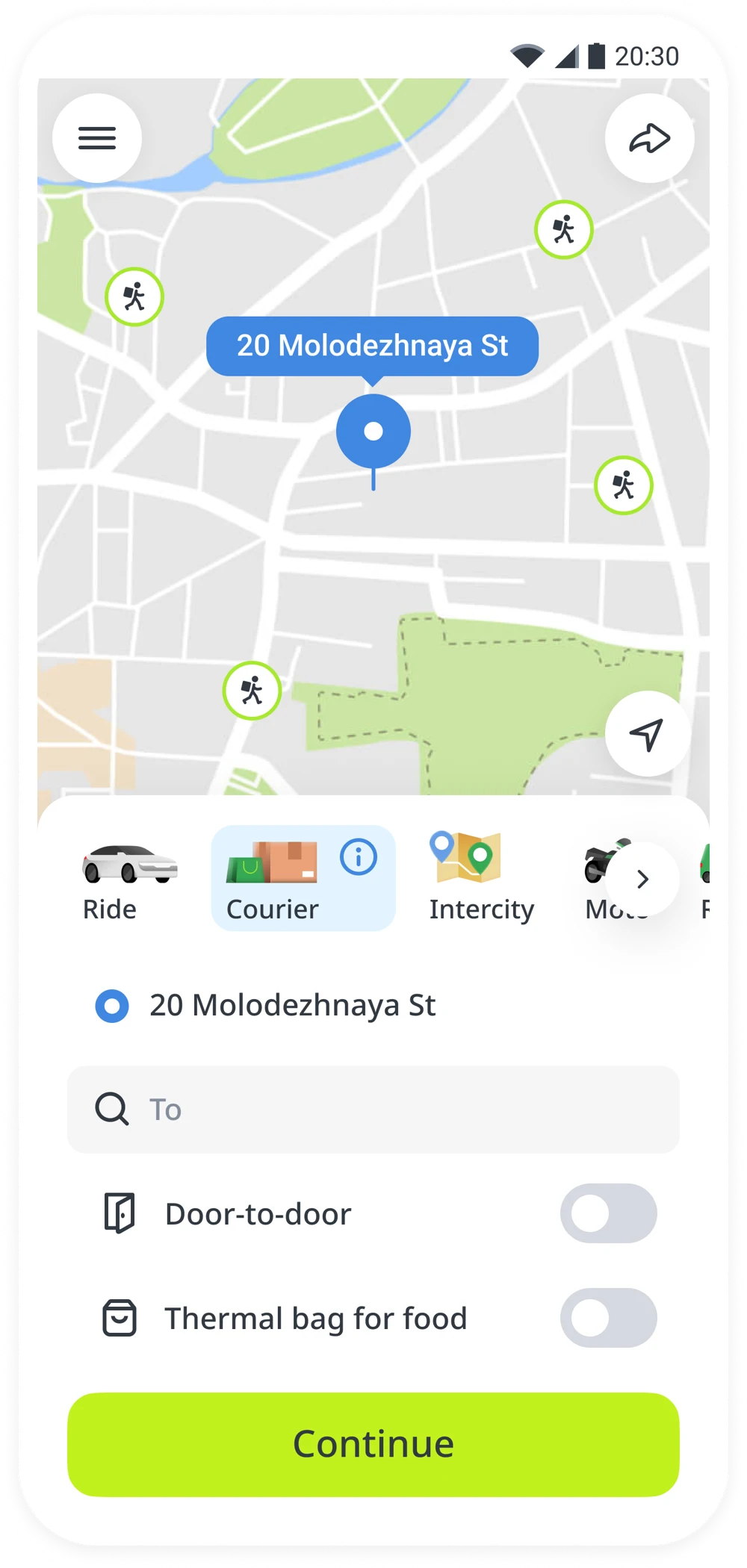
A replica of the legacy form, exploring an earlier price field and making the service’s benefits visible.
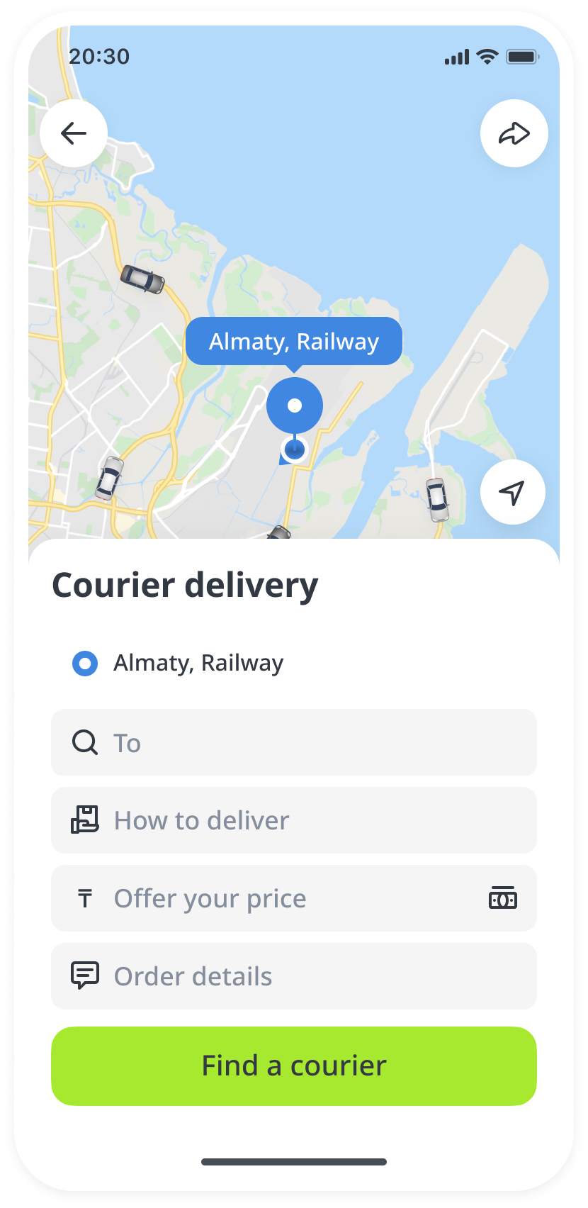
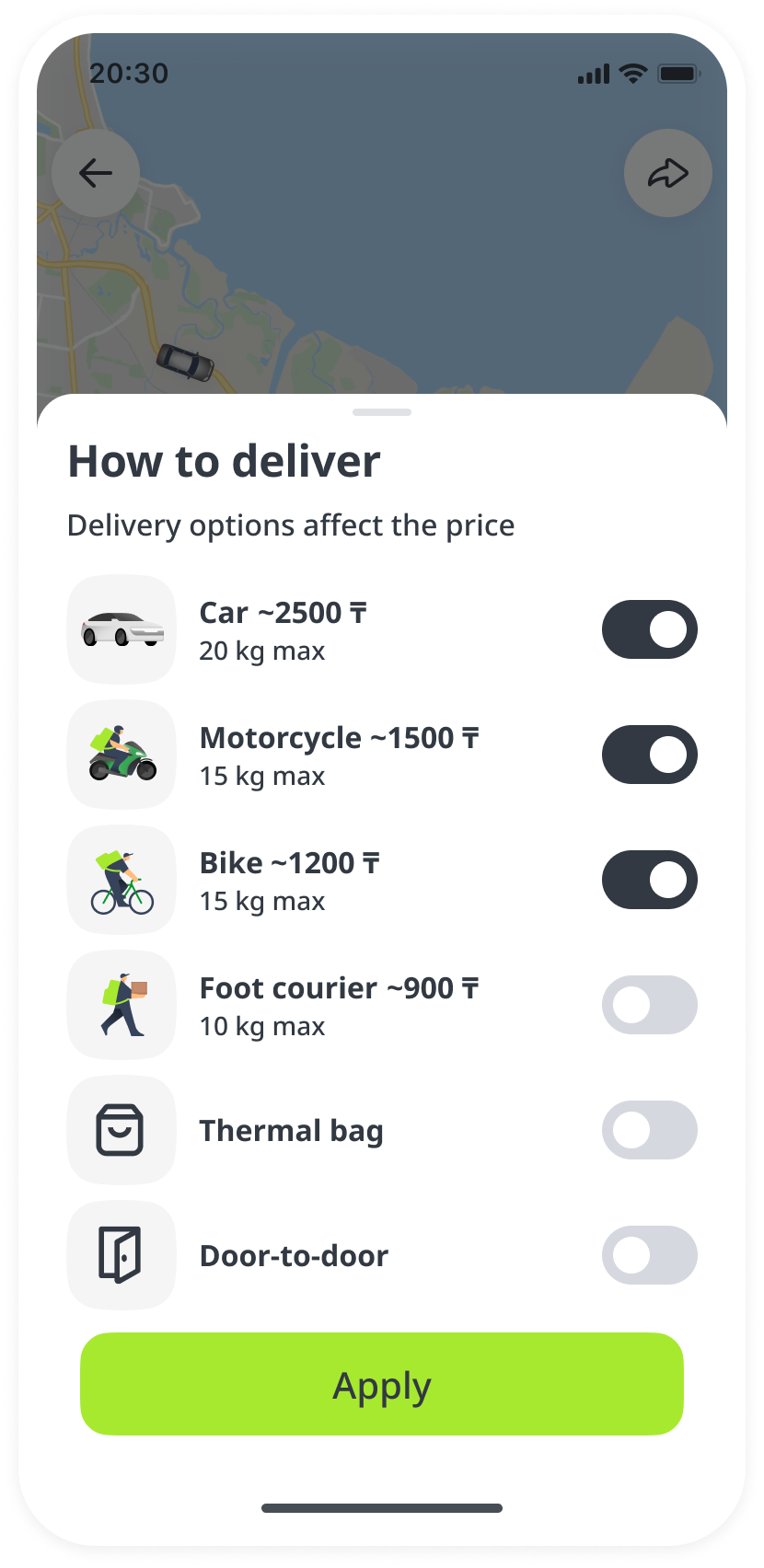
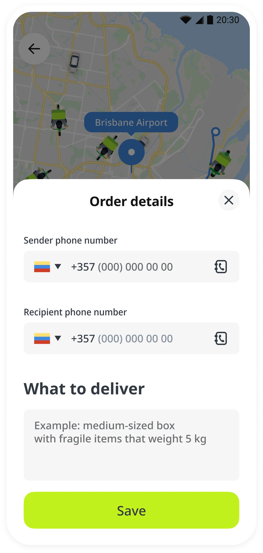
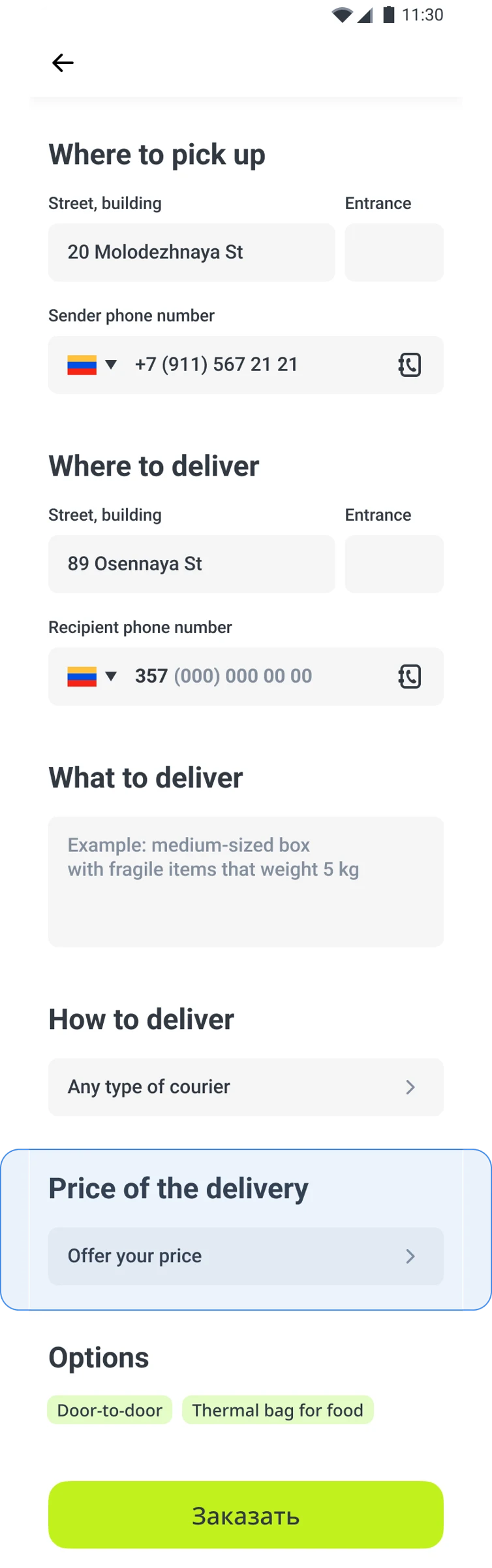
A simpler single-page form, with secondary details moved out of the main flow to reduce cognitive load.
A more radical, staged flow that integrates the information needed for matching and successful delivery.
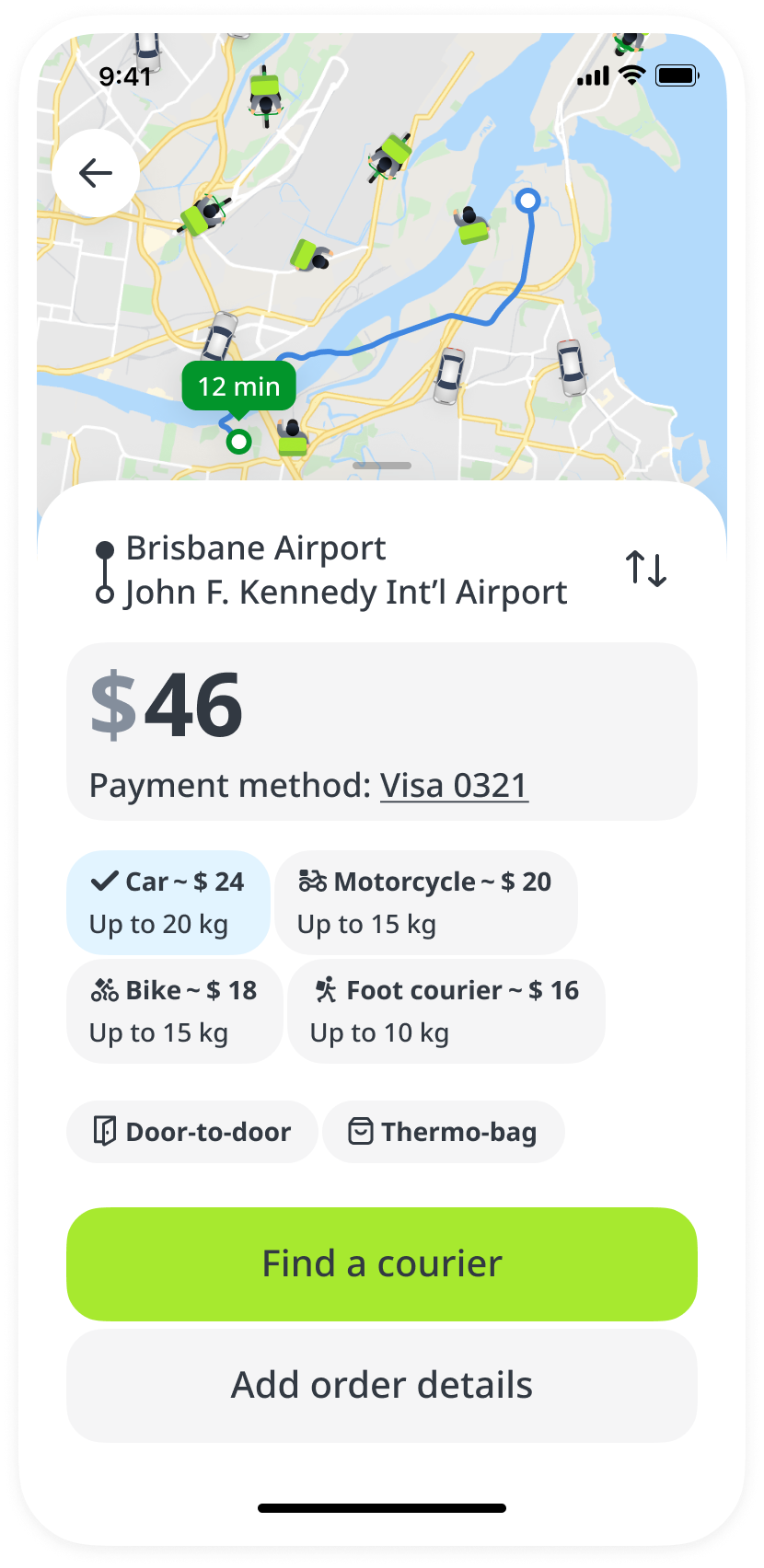
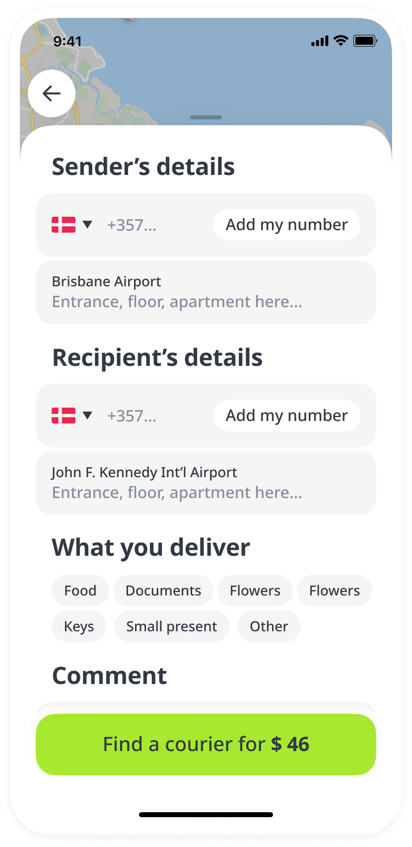
I organized a quantitative UX study to compare the three solutions. Real inDrive users received a push notification inviting them to complete a task in a prototype.
The task“Imagine you want to send flowers to a loved one using inDrive’s courier service. You need to deliver flowers from Dostyk Avenue, 82 to Abay Avenue, 2. You’d like both pickup and drop-off to be at the entrance. What would you do in this case?”
The share of users who started the prototype and successfully created an order.
Users who started entering points A and B for a city ride, then switched to Courier.
Users who tried to create an order without completing order details and encountered an error.
The original test artifacts show where users interacted with the forms.
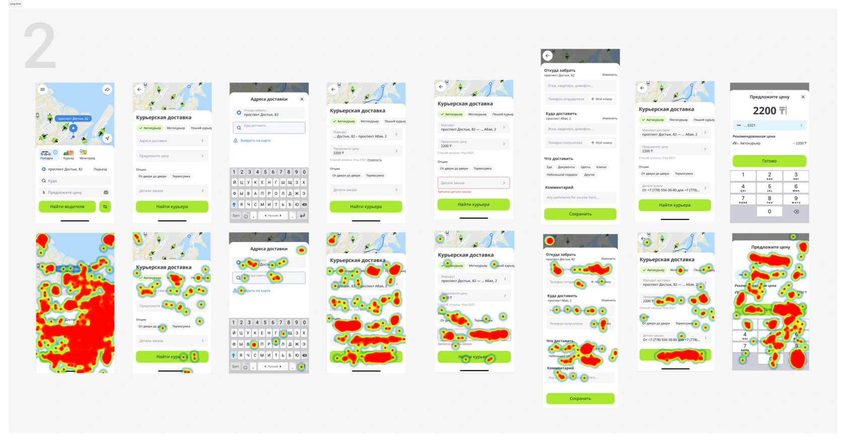
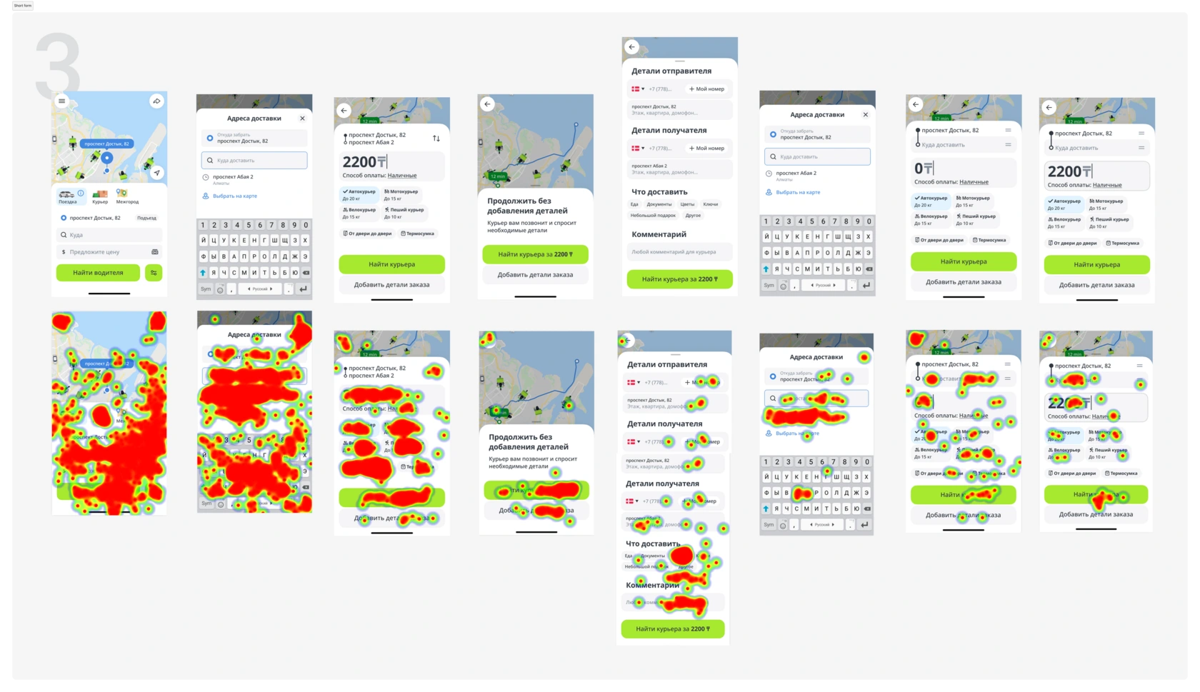
The second option won by a small margin, balancing a reasonable completion speed with a high rate of successful order creation.
The third option had the fastest completion time. This was partly due to the intentional absence of an error when users skipped the Order Details field.
We took Concept 02 into an A/B test.
| Metric | Short form (3) | 2 step form (2) | Monolith like (1) | Current NO |
|---|---|---|---|---|
| Avg time to complete | 65 seconds | 80 seconds | 157 seconds | 85 seconds |
| Avg time to overall | 43 seconds | 101 seconds | 72 seconds | 53 seconds |
| Total participants | 257 | 264 | 172 | 178 |
| Completed | 56 (22%) | 70 (26%) | 49 (29%) | 33 (19%) |
| Skipped | 32 (13%) | 26 (10%) | 21 (17%) | 28 (16%) |
| Dropped-off | 169 (65%) | 180 (68%) | 102 (60%) | 117 (66%) |
| Task complexity | 70% | 73% | 41% | 64% |
V20 uplift versus the control group
from product changes
The new form significantly compensated for the conversion drop. But results varied greatly between countries, and design was only part of the explanation.
A technical deep dive revealed that part of the conversion drop came from bugs introduced during the transition to microservices.
Separating supply types made certain order categories undeliverable in some cities. This helped explain why the A/B results differed so much across countries.
Order conversion varied by region. Analytics showed different patterns in required fields — such as the recipient’s phone number and package description — and in the order people completed them.
A universal form with the same mandatory fields everywhere could not provide the flexibility needed to optimize conversion in each market.
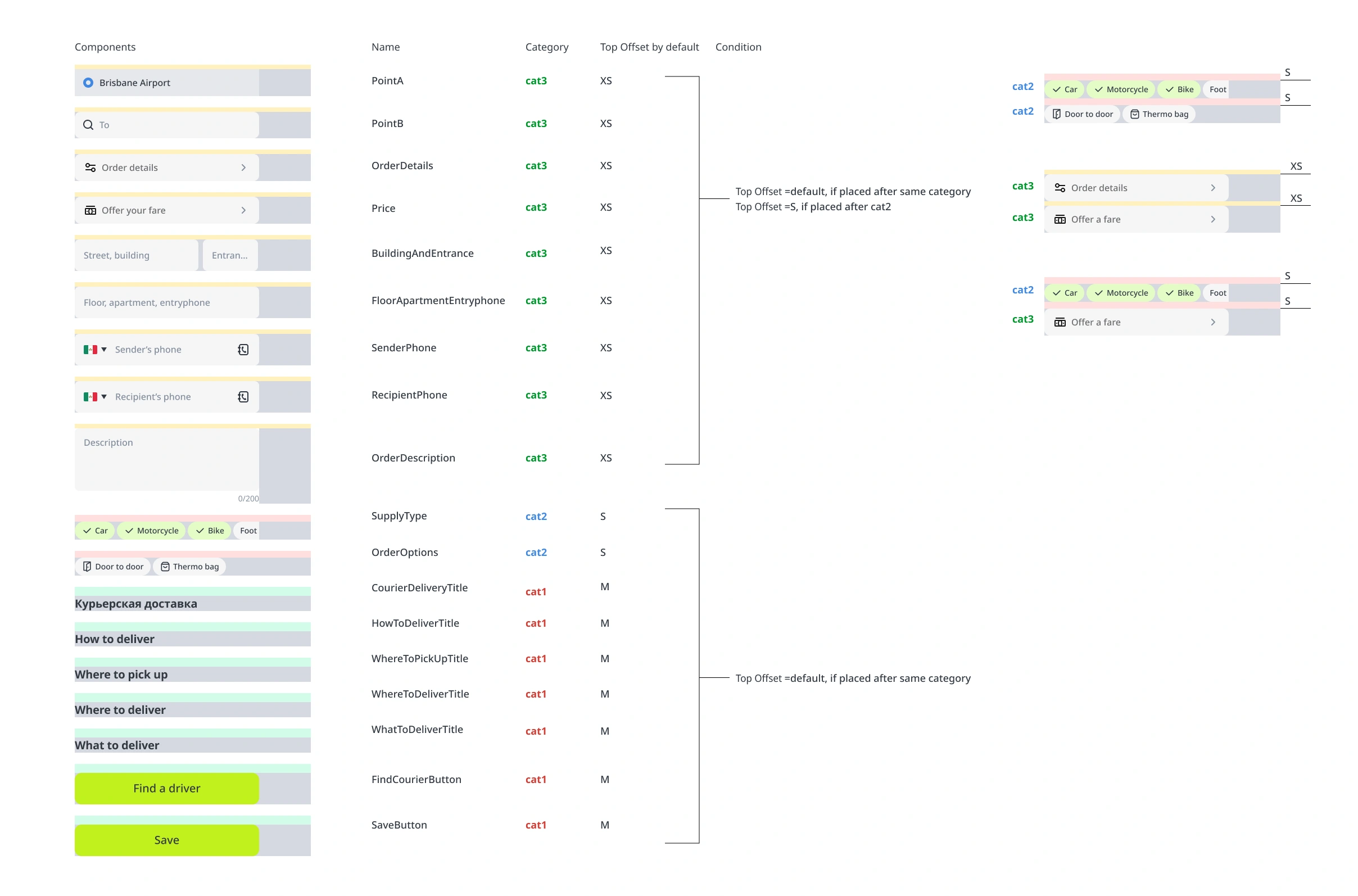
We developed an Order Form Builder based on the tested Concept 02, with refined spacing and field organization for consistency.
Customize which fields a user needs to complete.
Show the fields relevant to each market.
Adjust the sequence to regional completion patterns.
V20 increase after launching the builder
Through a series of improvements, including the new order form and the builder, we fully mitigated the conversion drop and achieved a 2.3% increase in V20 after the builder launched.
We also gained a clearer understanding of regional courier behaviors and form completion patterns. The journey to a courier order often begins outside the courier section itself.