inDrive · iOS & Android, 2024

Transition
to superapp

For several years, the company has been trying to transition to a super app to effectively diversify its business. I will share the successful results of a series of experiments.

Explore the case ↓
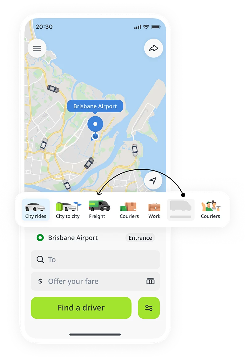
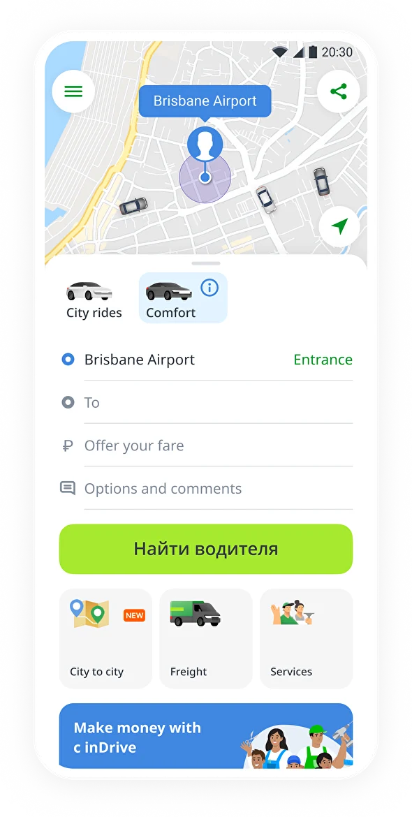
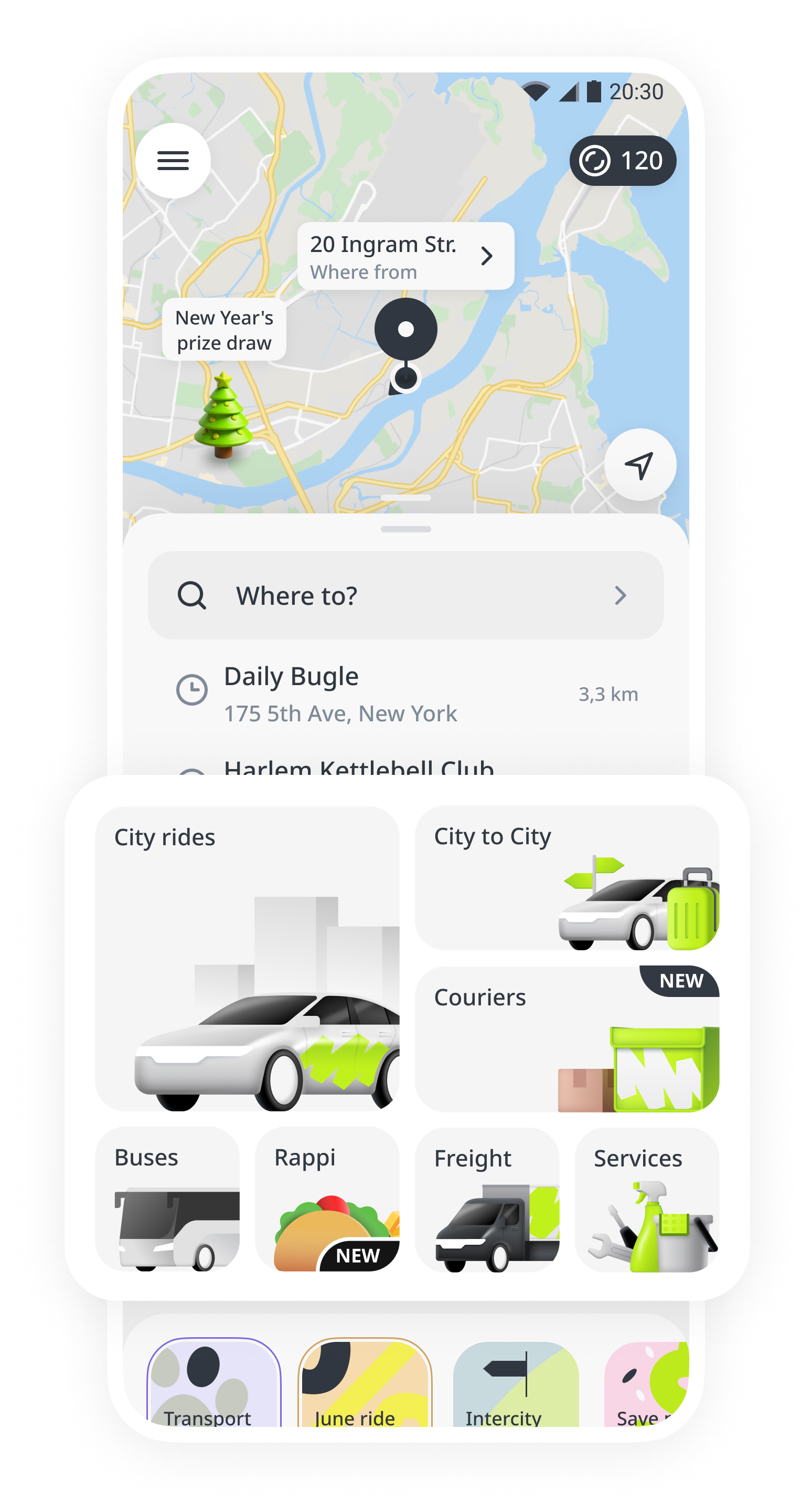
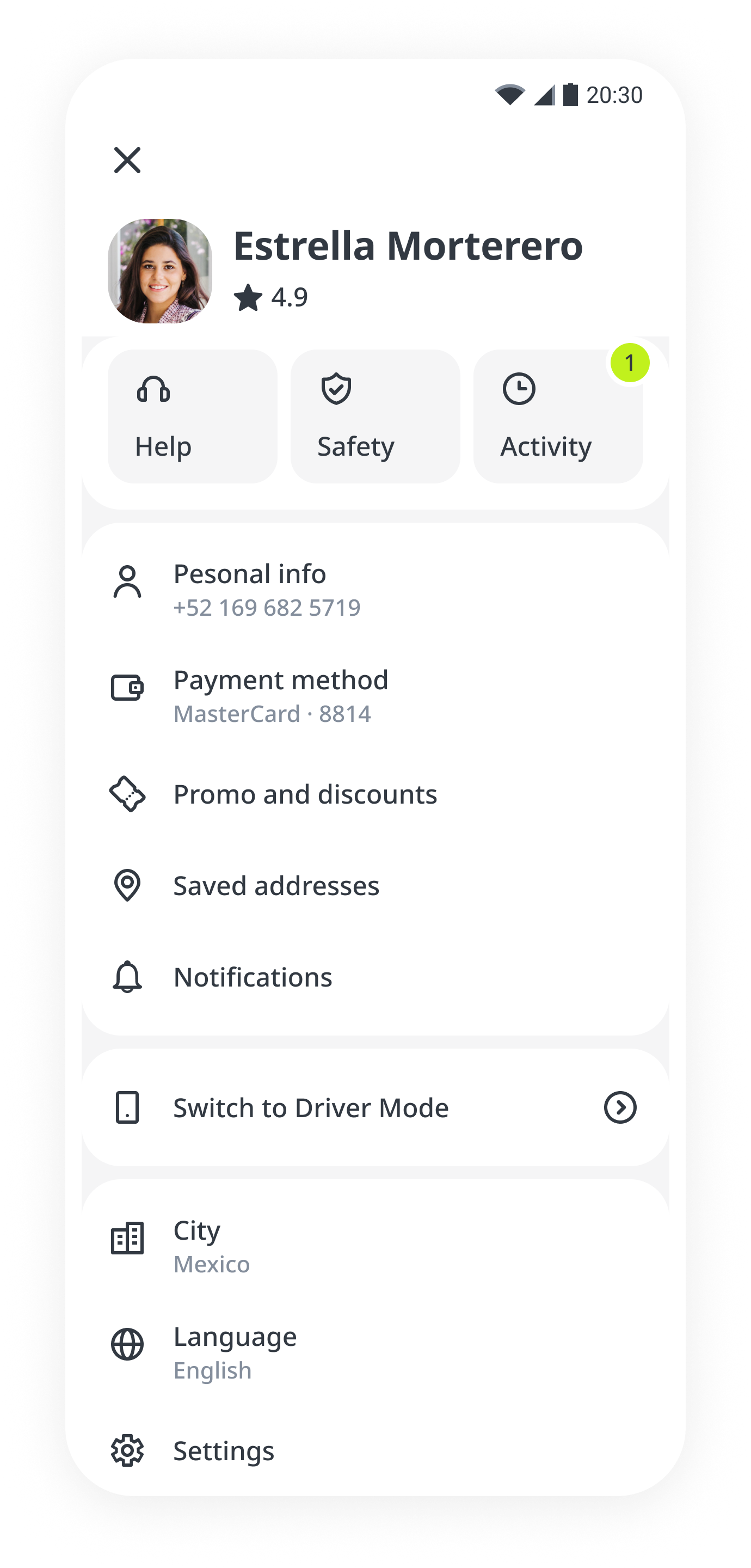
inDrive city ride interfaceinDrive superapp home with service cards

The business outgrew the app

inDrive is a ride-hailing company operating in over 50 countries. However, the development of the app’s architecture did not keep pace with the growth of the business.

I work in a division that includes courier and freight deliveries as well as intercity rides. The app was originally designed architecturally and visually for ride-hailing, with other businesses simply added on without redesigning the interface or user flows.

This case explores how my team and I transformed a ride-hailing-focused application into a super app through design and product changes.
Visibility

Position changes discovery

The open rate and, ultimately, the GMV of verticals may depend on the position of the service icon in the carousel. The closer the icon is, the higher the open rate. Placing all icons on the main screen could increase openings.

Earlier app home with a carousel of service icons
Risk

City rides could lose out

Super app solutions can be risky for the core ride-hailing business. A 2023 experiment negatively impacted ride-hailing GMV. For our unit, a super app was a growth driver; for the core business, it posed a significant risk.

Earlier inDrive city ride screen with other services below

Give every service a place on the main screen

If we make the entry point for City Rides more prominent, the growth of other verticals might be substantial enough to outweigh the decline of the core business.

Before · service carouselOriginal service carousel in ride-hailing screen
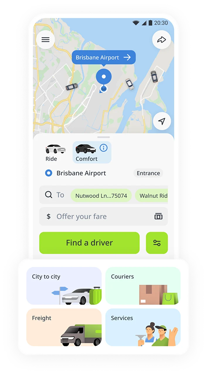
Experiment · dedicated brand cardsExperiment with dedicated cards for each vertical

We launched a low-cost A/B test: dedicated brand cards for each vertical, with the carousel reserved for tariffs. The rest of the interface remained unchanged.

+100%

GMV for intercity rides

Growth, with a trade-off

Service openings and orders increased significantly. However, city rides GMV declined slightly, and growth in the other verticals did not fully offset that decline.

The promising signal gave us grounds to pitch a more ambitious redesign of the main screen.

Nothing inspires better than a strong design vision

Together with the designers, I prepared a concept for passengers and drivers, with a strong focus on visual appeal. Our creative design team developed new vertical icons to attract more users. Alongside product managers, I presented the strategy through multiple pitch sessions.

Superapp design vision with vertical cards on the home screenSuperapp vision emphasizing City Rides and service navigation
A vision for the next inDrive experience

Visual appeal, tested

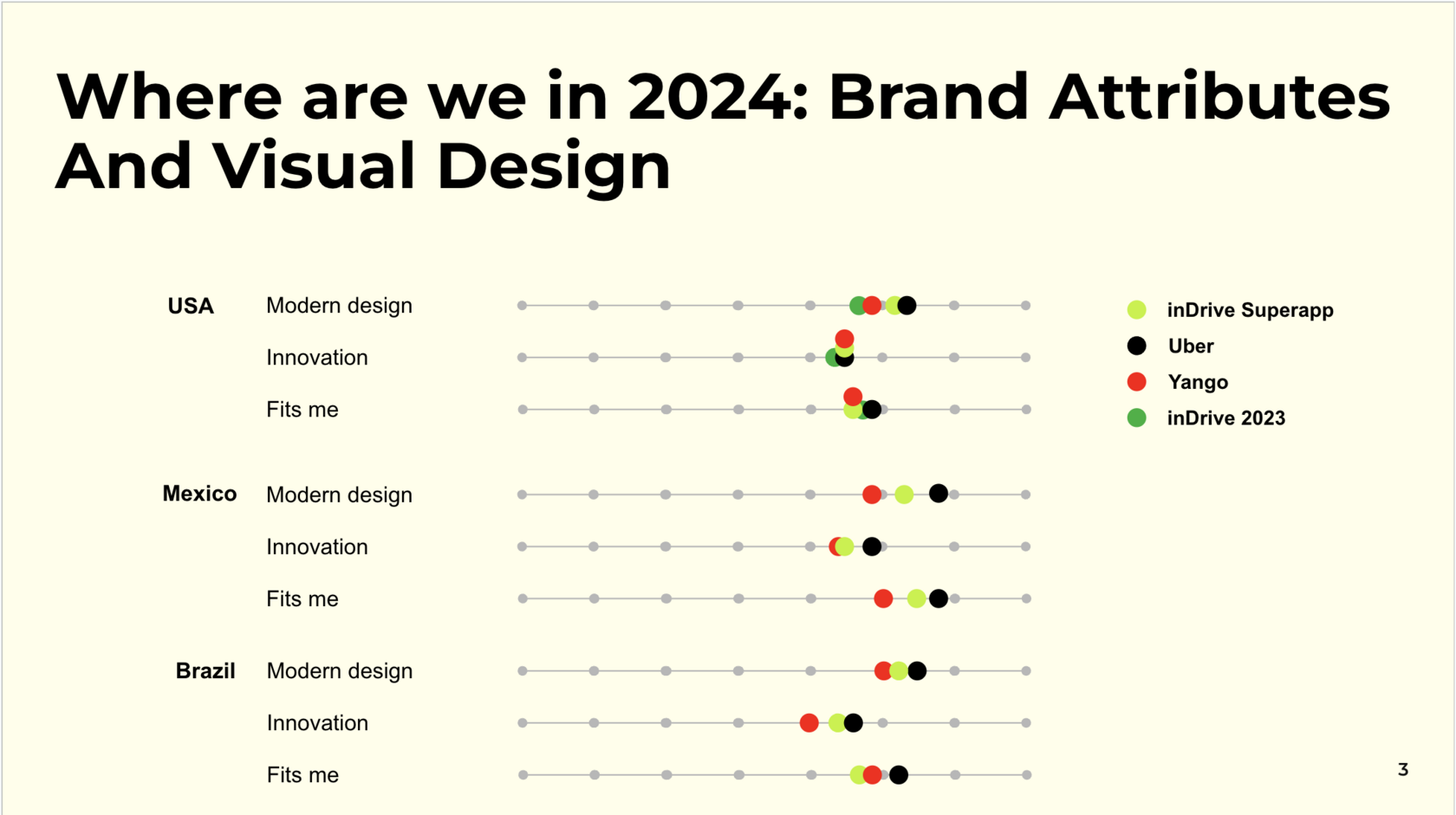
To strengthen our case, I requested a design perception test from our UX team. Users evaluated our app and competitors (Uber, Yango) on specific parameters, and we compared their ratings with the previous year.

Visual appeal test comparing inDrive brand attributes and visual design

The new design significantly outperformed the old version and ranked competitively among industry leaders.

The vision, strategy, and research-backed arguments secured approval for the main screen redesign and additional team resources.

Test the way back

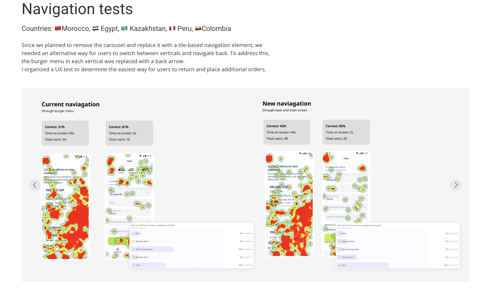
With the carousel replaced by tile-based navigation, users needed another way to switch verticals and return. We replaced the burger menu within each vertical with a back arrow.

I organized a UX test to find the easiest way for users to return and place additional orders. The back arrow proved more effective, and the next experiment significantly increased the open rate.

Test countries

🇲🇦 Morocco · 🇪🇬 Egypt · 🇰🇿 Kazakhstan · 🇵🇪 Peru · 🇨🇴 Colombia

Navigation UX test: current burger-menu navigation versus back-arrow navigation, with heatmaps and task results
Current navigation compared with the new back-arrow flow · heatmaps and task results

One home. Clear paths into every service

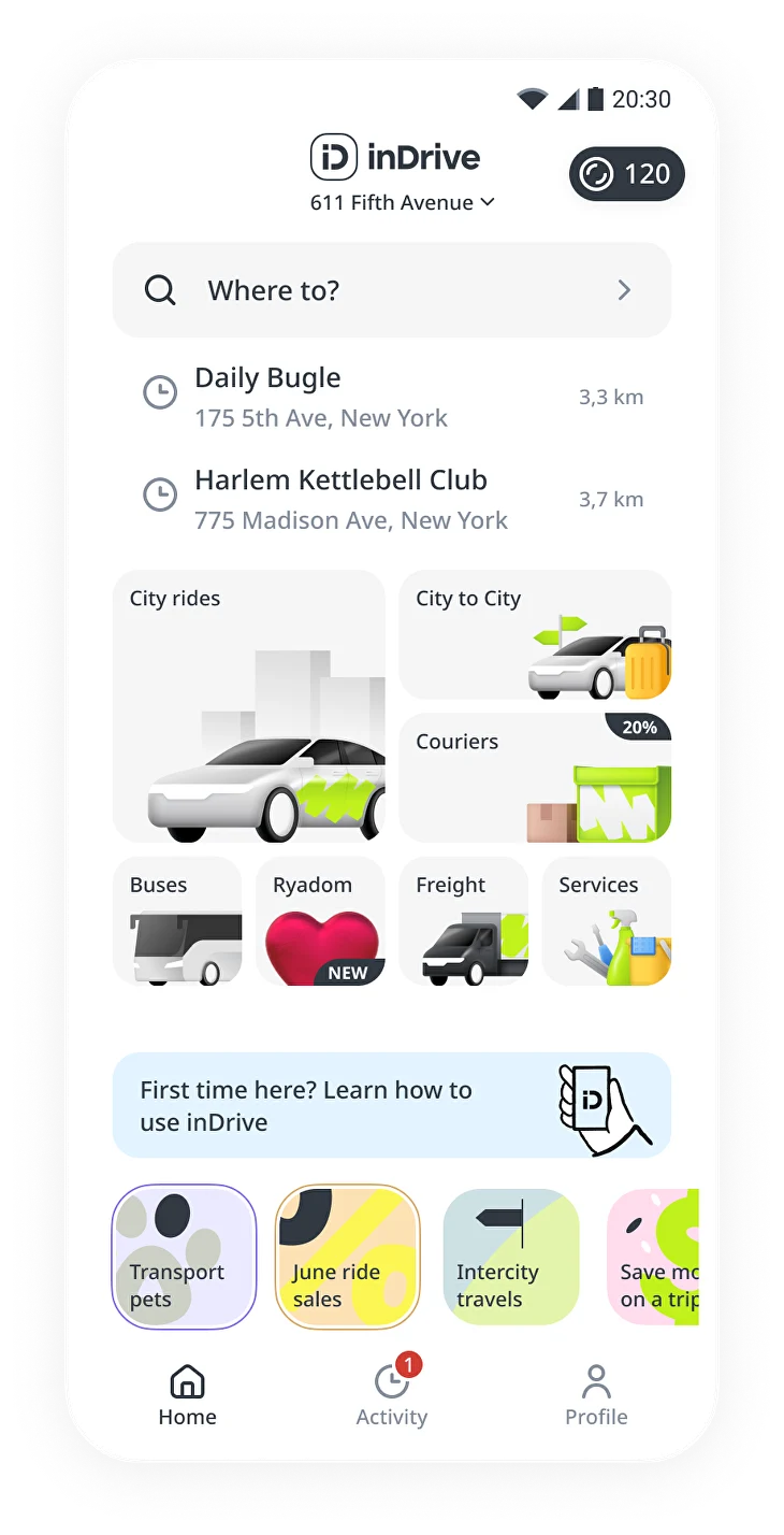
The team designed a new card layout and confirmed through UX tests that it was more engaging. We gave City Rides an entire section and repeated it in the largest card, creating two entry points for the core service.

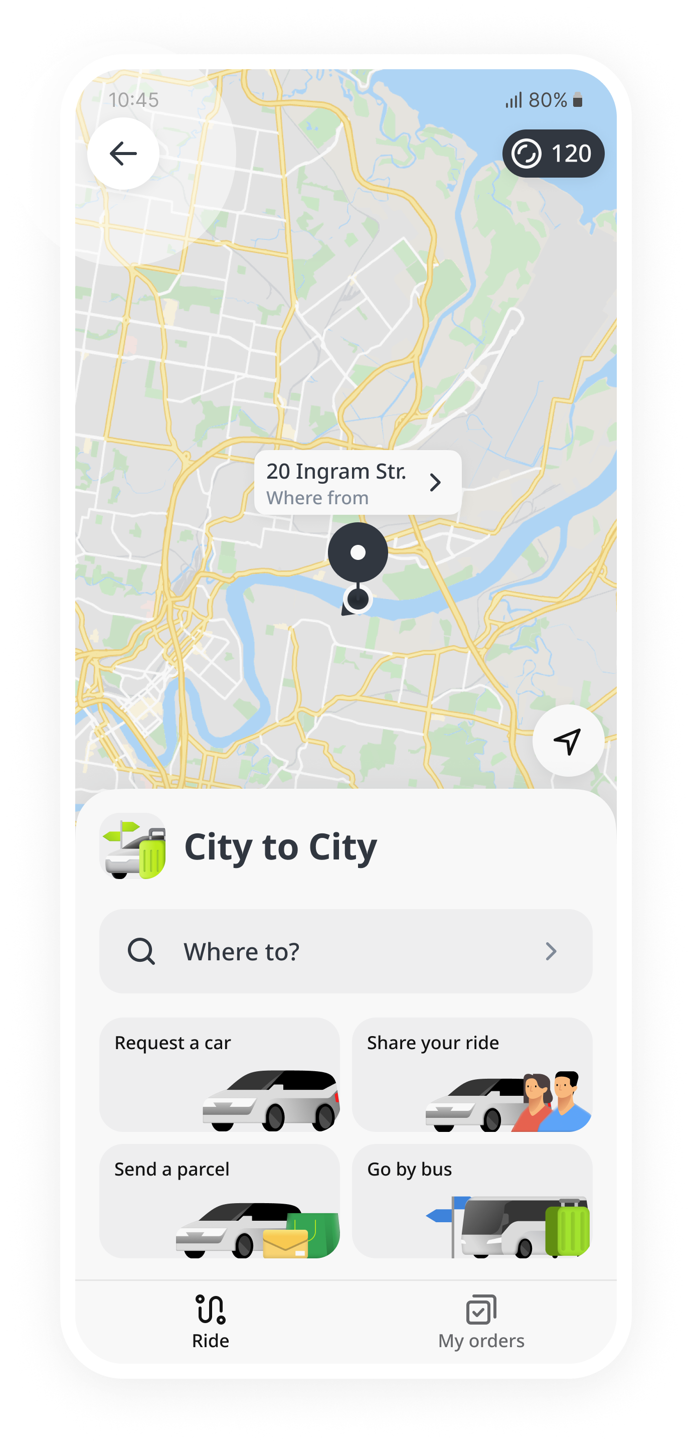
New superapp home with a tile-based service layoutCity to City screen with a back arrow in the final navigation concept

Growth across the app

These design changes offset the decline in the core vertical. With GMV growth in the verticals now in focus, we saw an overall increase in GMV.

New superapp design · currently being tested

Make the whole app feel connected

Given the success of the previous changes, we can now proceed with finalizing the transition to a super app:

  1. Test a layout without the map in regions where the verticals have a strong market presence.
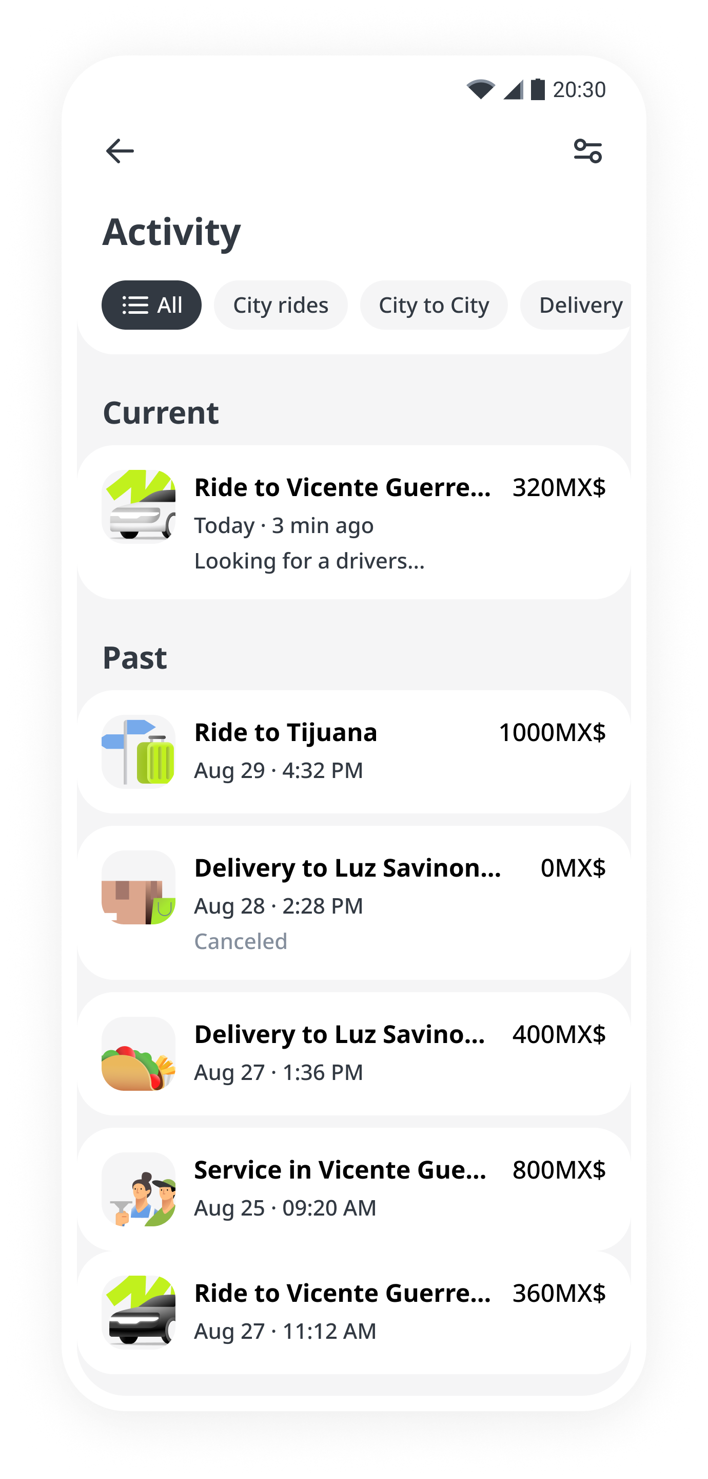
  2. Consolidate duplicate pages within each vertical into cross-vertical experiences, such as a unified profile and shared order history.
Shared activity and order history across servicesUnified profile conceptSuperapp home concept without a map

Design manager
& art director

I was responsible for hiring, the design hypotheses backlog, the design iteration roadmap, cross-functional communication, and the quality of design solutions. Most of the design work was done by Vladislav Slivko, with support from Lolita Rudakova at the start.